


“倒影”做法在 PS 这些作图软件中很简单吧,复制一个图层,加个蒙版分分钟就能做出倒影效果。
在写这篇文章之前的认知中,CSS 要实现倒影必须要复制一个 HTML 节点,再利用透明度之类的 CSS 来模拟倒影。
在翻了 MDN 之后,才发现,倒影有多种方法实现,本文就捡几种相对简单的实现方法来看看~~
1、复制元素
复制一个倒影元素,利用渐变遮罩做出倒影效果:
<div class="box">  <img src="./face.png" >  <img class="reflection" src="./face.png" ></div>
<style>  .box {
    position: relative;
  }  .box img {
    width: 200px;
  }  .reflection {
    position: absolute;
    left: 0;
    top: 0;
    transform-origin: bottom center;
    transform: scaleY(-1); /* 垂直翻转 */    mask-image: linear-gradient(to top, rgba(0, 0, 0, 0.5), transparent 80%, transparent);
  }</style>
运行效果如下:

2、利用伪元素
使用伪元素加上 CSS 渐变也能实现倒影效果,但倒影没有过渡,效果不是很好~~
<div class="box">  <img src="./face.png" class="reflection"></div>
<style>  .box {
    position: relative;
    width: 200px;
  }  .box img {
    width: 100%;
    display: block;
  }  .box::after {
    content: "";
    position: absolute;
    top: 100%; /* 定位到图片下方 */    left: 0;
    width: 100%;
    height: 100%; /* 倒影高度 */    background: linear-gradient(to bottom,
                rgba(255,255,255,0.5),
                rgba(255,255,255,0)),
                url('./face.png') no-repeat center bottom;
    background-size: cover;
    transform: scaleY(-1); /* 垂直翻转 */    opacity: 0.3; /* 倒影透明度 */  }</style>
运行效果如下:

3、Canvas
与图形相关的东东,Canvas 基本都能混口饭吃~~
<canvas id="canvas" width="200" height="532"></canvas>
<script>  const canvas = document.getElementById('canvas');
  const ctx = canvas.getContext('2d');

  const img = new Image();
  img.src = './face.png';

  const width = 200; // 显示宽度  const height = 266; // 显示高度
  img.onload = () => {
    // 绘制原图    ctx.drawImage(img, 0, 0, width, height);

    // 保存画布状态    ctx.save();

    // 创建倒影(垂直翻转)    ctx.translate(0, 532);
    ctx.scale(1, -1);

    // 绘制倒影图片    ctx.drawImage(img, 0, 0, width, height);

    // 添加渐变遮罩    const gradient = ctx.createLinearGradient(0, height, 0, height * 2);
    gradient.addColorStop(0, 'rgba(255,255,255,0.5)');
    gradient.addColorStop(1, 'rgba(255,255,255,0)');

    ctx.globalCompositeOperation = 'destination-out';
    ctx.fillStyle = gradient;
    ctx.fillRect(0, 0, width, height);

    // 恢复画布状态    ctx.restore();
  };
</script>
运行效果如下:

4、SVG 蒙版
在写这篇文章之前,还以为 SVG 的滤镜可以做到倒影效果,结果尝试一番之后发现还是不行,最多只能做出一个阴影效果,倒影要的垂直翻转 SVG 滤镜貌似不支持!!最终只能使用蒙版实现倒影:
<svg width="200" height="532" xmlns="http://www.w3.org/2000/svg" viewBox="0 0 200 532">  <defs>    <!-- 渐变蒙版 -->    <linearGradient id="grad" x1="0%" y1="0%" x2="0%" y2="100%">      <stop offset="0%" stop-color="black" />   <!-- 完全透明 -->      <stop offset="100%" stop-color="white" /> <!-- 完全不透明 -->    </linearGradient>
    <mask id="gradient-mask">      <rect x="0" y="0" width="200" height="466" fill="url(#grad)"/>    </mask>  </defs>  <!-- 定义原始图像 -->  <image id="source" href="./face.png" x="0" y="0" width="200" height="266" preserveAspectRatio="xMinYMin"/>  <!-- 倒影 -->  <use href="#source" transform="translate(0,532) scale(1,-1)" mask="url(#gradient-mask)" /></svg>
运行效果如下:

5、box-reflect
box-reflect 可以很简单的实现倒影,但除了 webkit 内核支持,其他的浏览器都难过~~
使用方法:
<div class="box">  <img src="./face.png" class="reflection"></div>
<style>  .box {
    position: relative;
    width: 200px;
  }  .box img {
    width: 100%;
    display: block;
    /* 关键属性:下方倒影,距离10px,带渐变遮罩 */    -webkit-box-reflect: below 10px linear-gradient(to bottom,
                    rgba(255,255,255,0),
                    rgba(255,255,255,0.5));
    /* 标准语法(目前仅Webkit内核支持) */    box-reflect: below 10px linear-gradient(to bottom,
                    rgba(255,255,255,0),
                    rgba(255,255,255,0.5));
  }</style>
Chrome 中的运行效果:

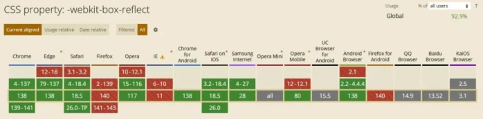
使用方式异常简单,但兼容性是一大问题:
写在最后
-webkit-box-reflect 是个好东西,可浏览器不支持,也只能是小众玩法~~
倒影就和液态玻璃一样,需求不高浏览器厂商就不着急支持,等啥时候有一个大的 UI 风向标了估计就会排上日程!!
© 版权声明
文章版权归原作者所有,本站只做转载和学习以及开发者个人原创。声明:下载本站资源即同意用户协议,本站程序仅供内部学习研究软件设计思想和原理使用,学习研究后请自觉删除,请勿传播,因未及时删除所造成的任何后果责任自负。
THE END


暂无评论内容